Brand identity for medical centers and private clinics
- New clinics that need a complete identity before launch
- Clinics with an established strategy that are ready to translate positioning into a visual system
- Medical centers with an outdated look whose current visual language no longer reflects the quality of care, environment, or team
- Clinic groups and networks that need one recognizable system across multiple locations and specialties
- Specialist clinics that need to stand apart from predictable category aesthetics
- Clinics preparing for a website redesign that need to define the visual language before rebuilding the digital experience
- Healthcare brands with inconsistent communication whose website, social media, print, and physical space feel disconnected
- Growing healthcare organizations adding services, sub-brands, or locations that need a flexible visual system


What it’s like to work with MOMENTOFIMPACT



Why healthcare brand identity fails to build recognition and trust
Many healthcare brands rely on the same visual signals, which makes even a high-quality clinic feel generic, dated, or disconnected from the real standard of care and service.
The brand looks like every other clinic
The identity does not reflect the positioning
Digital and physical touchpoints feel disconnected
The system stops at the logo
The visual language dates too quickly
The identity cannot scale

What is included
1. Brand and context analysis
We review positioning, audience, competitors, clinic environment, communication channels, and the full list of applications the identity needs to support.
2. Visual direction
We develop conceptual routes that communicate the character of the brand and avoid default healthcare aesthetics. The focus is on principles, not moodboards alone.
3. Logo and mark system
We create the core logo plus horizontal, vertical, compact, and monochrome versions for different formats and scales.
4. Design system
We define color, typography, graphic elements, composition, iconography, and photography direction. Together these form a recognizable brand language.
5. In-clinic and marketing applications
We adapt the system to the touchpoints that patients and teams actually use:
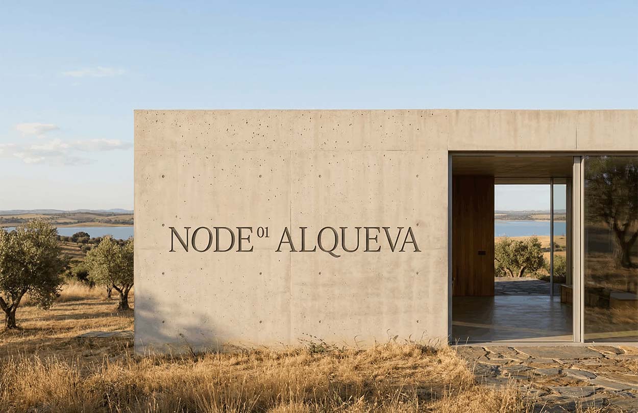
- signage and wayfinding
- documents and forms
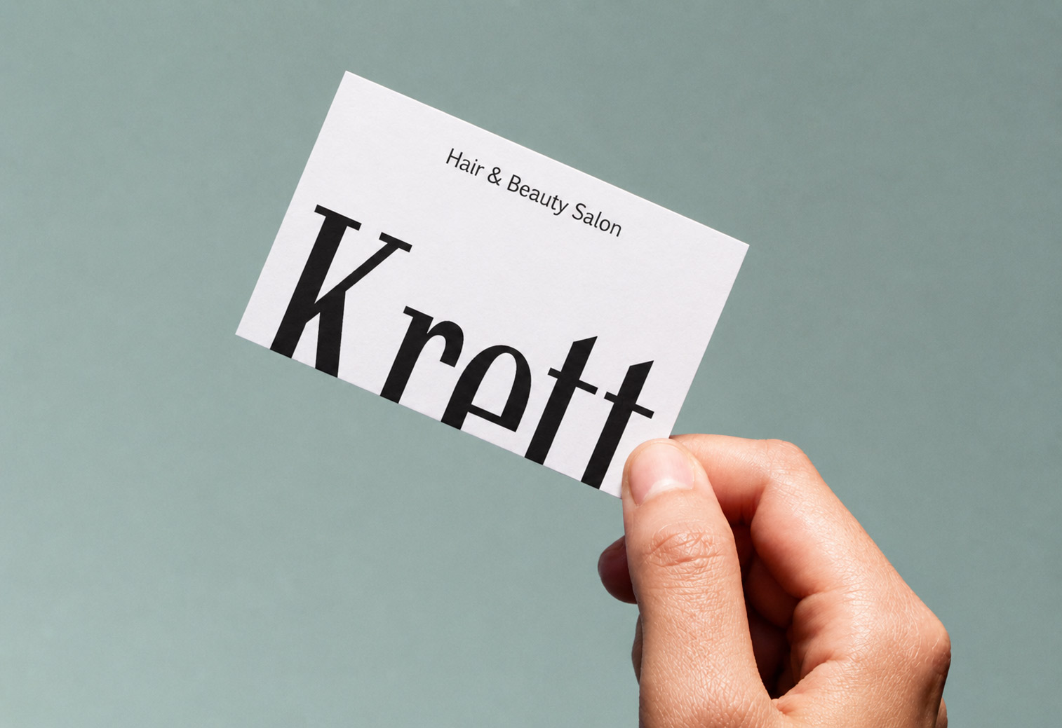
- cards and printed materials
- folders and patient materials
- presentations
- digital advertising
- social media templates
6. Digital adaptation
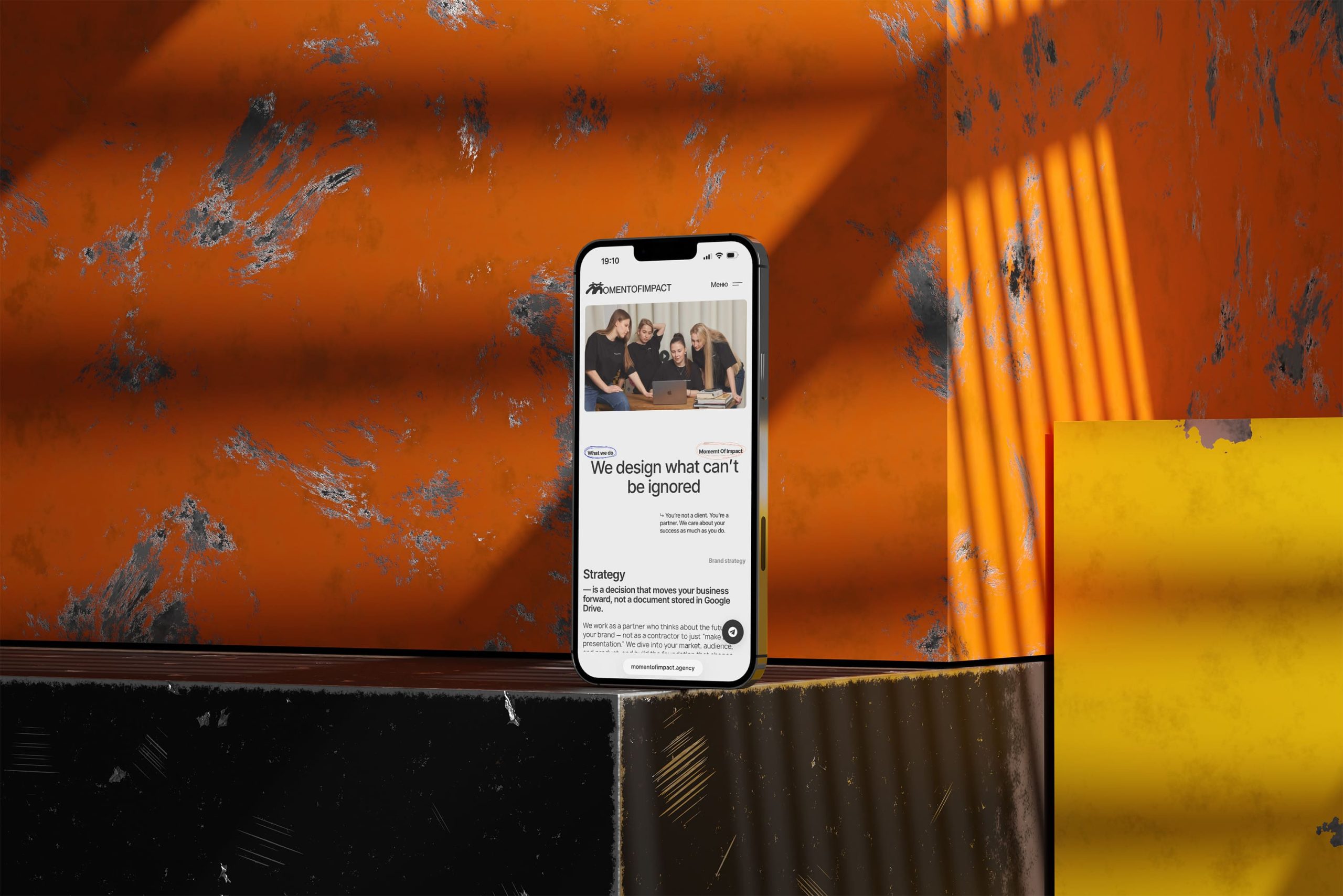
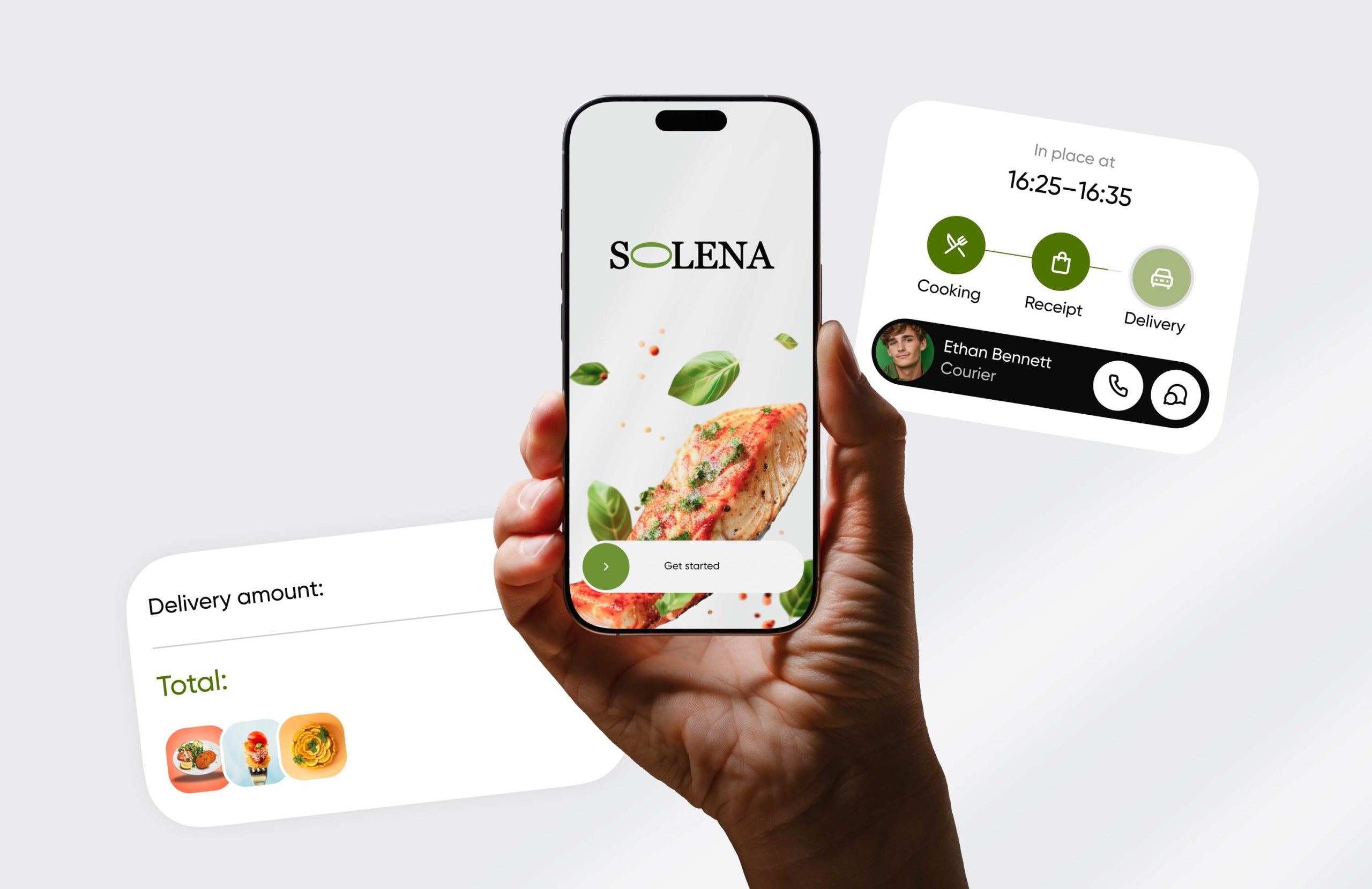
We establish principles for websites, social media, email communication, and paid media so the identity keeps its character in digital environments.
7. Brand guidelines
We document logo use, colors, typography, graphics, photography, and core layouts so internal teams and partners can work consistently.
8. Final asset delivery
We organize source files, templates, and brand assets for practical day-to-day use. When needed, we support implementation across website, clinic environment, and marketing.
9. Dispute resolution
We aim to resolve work-related matters through open communication and mutual understanding. Where a dispute arises, the parties will first seek a resolution through negotiation and, when necessary, in accordance with applicable Ukrainian law.
10. Payment for services
Payments are processed through secure third-party payment providers according to the agreed terms. We do not store users’ payment details.
Related services
Social Media Marketing for medical centers and private clinics
Brand & social presence audit
Content strategy & channel roles
Tone of voice & communication messages
Visual system & content templates
Format development (Reels, Stories, carousels, banners)
Website Development for medical centers and private clinics
Website strategy
UX/UI design
Website development
Landing pages
SEO & optimization
UX/UI for medical centers and private clinics
Product & user research
User flow & information architecture
Wireframes & prototyping
Visual UI design
Digital product & platform design
Brand strategy for medical centers and private clinics
Brand audit & market analysis
Brand positioning & value proposition
Segmentation & audience profiles
Brand messaging & tone of voice
Content strategy & communication channels
We’ll build a system for your project
 After you submit the form, we’ll
suggest the most suitable
collaboration format for your project.
