SAET
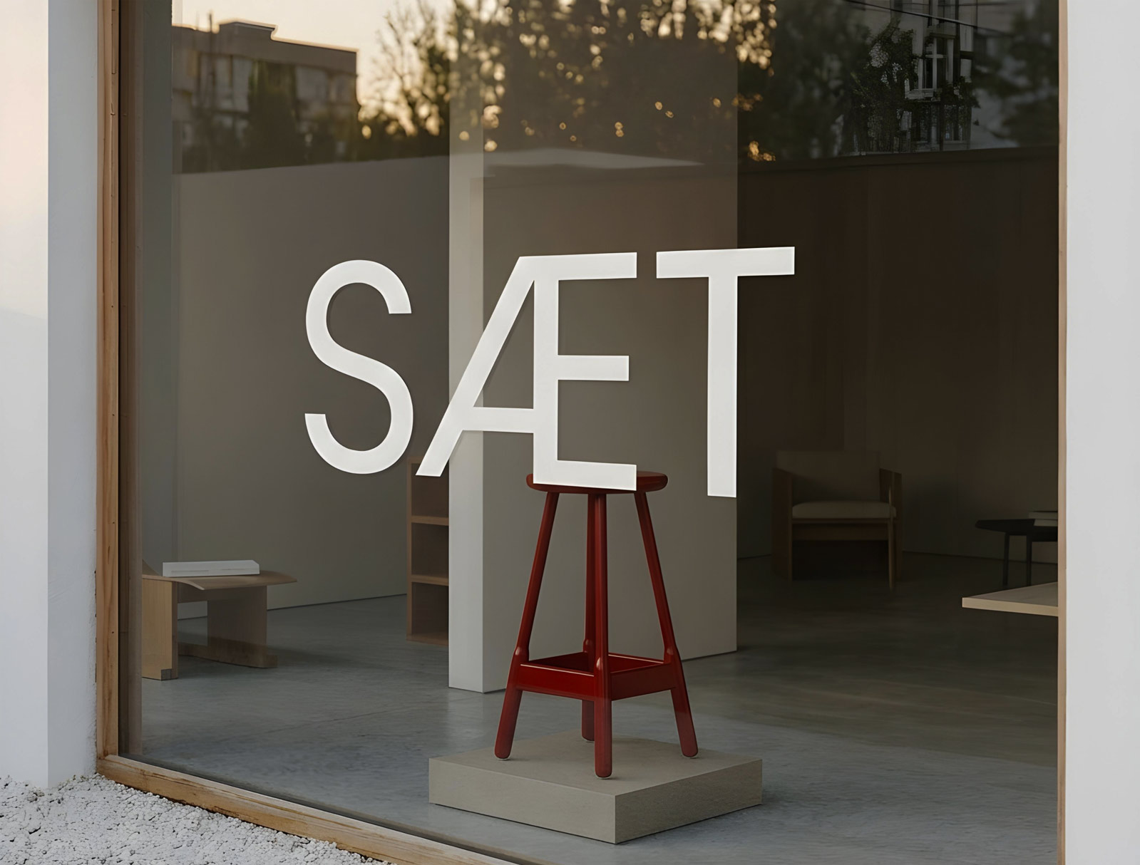
For SAET, we created a visual system that conveys the brand’s calm character through form, space, and tactility.
The identity is built around clean typography and restrained composition, allowing the furniture and materials to remain the main focus.
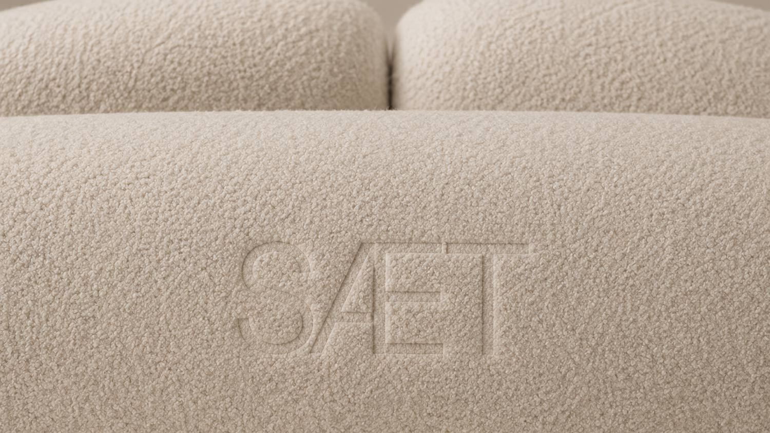
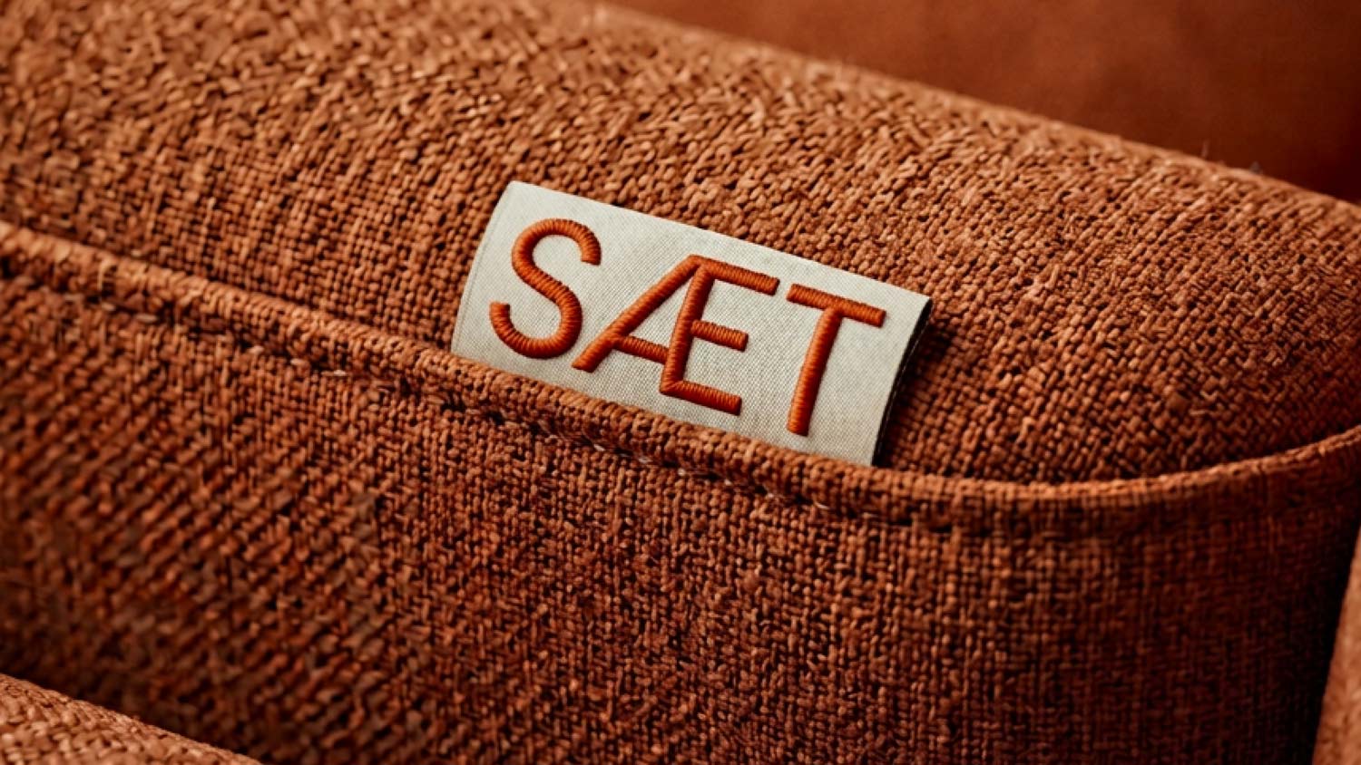
We worked with a strong sense of atmosphere — combining soft textures, warm tones, and architectural simplicity into a cohesive visual language.
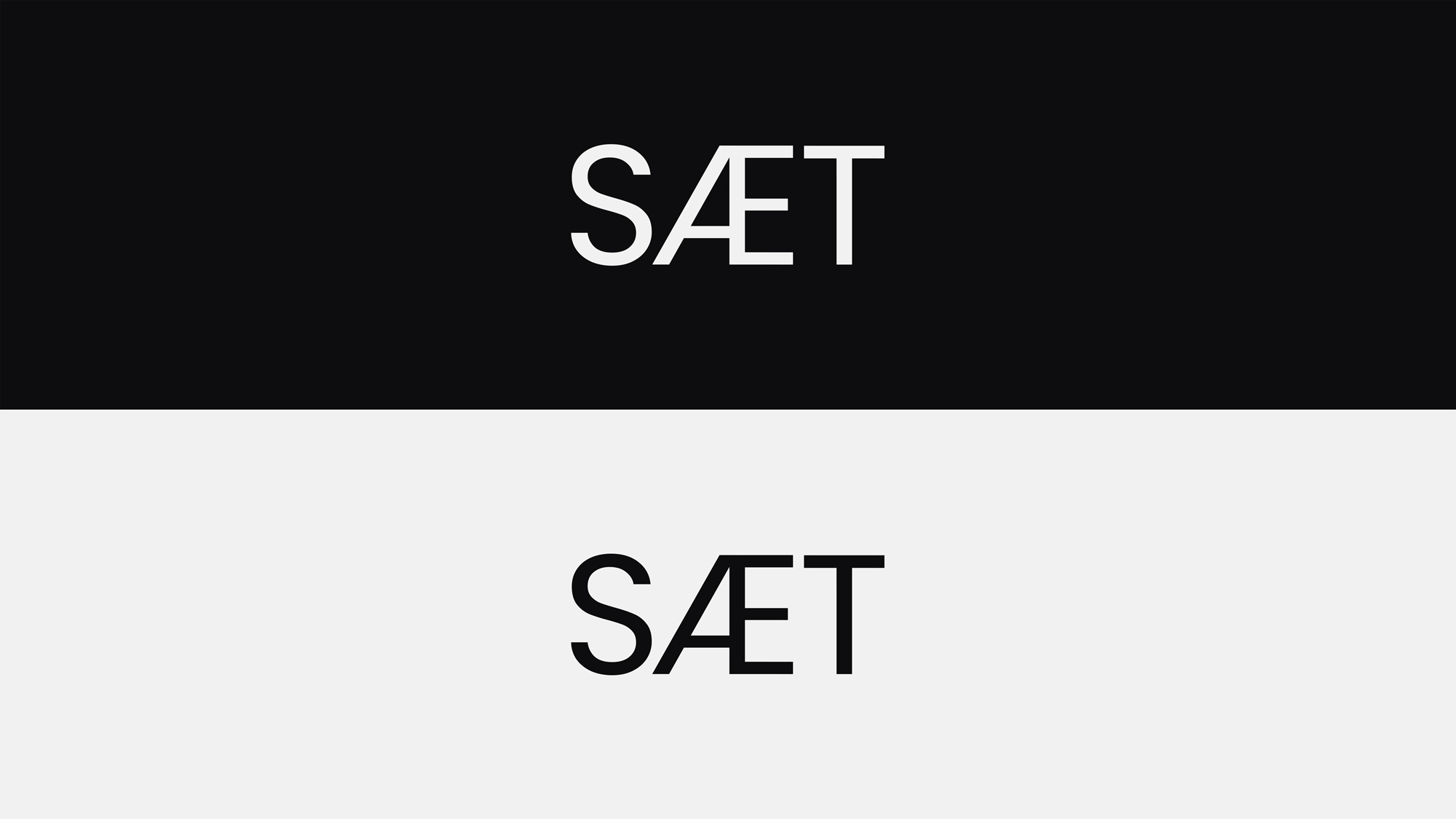
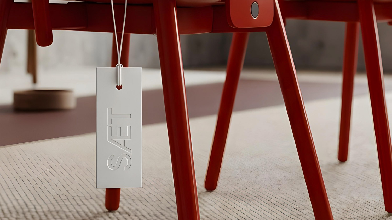
The logo was designed as a minimalist mark with a distinctive letter connection that creates a recognizable brand silhouette.
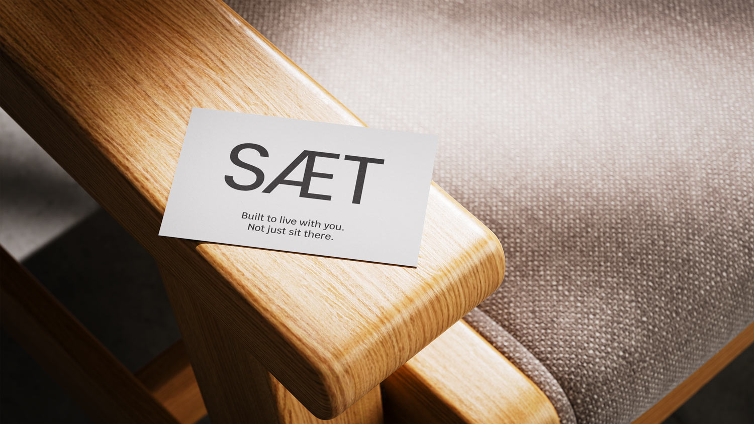
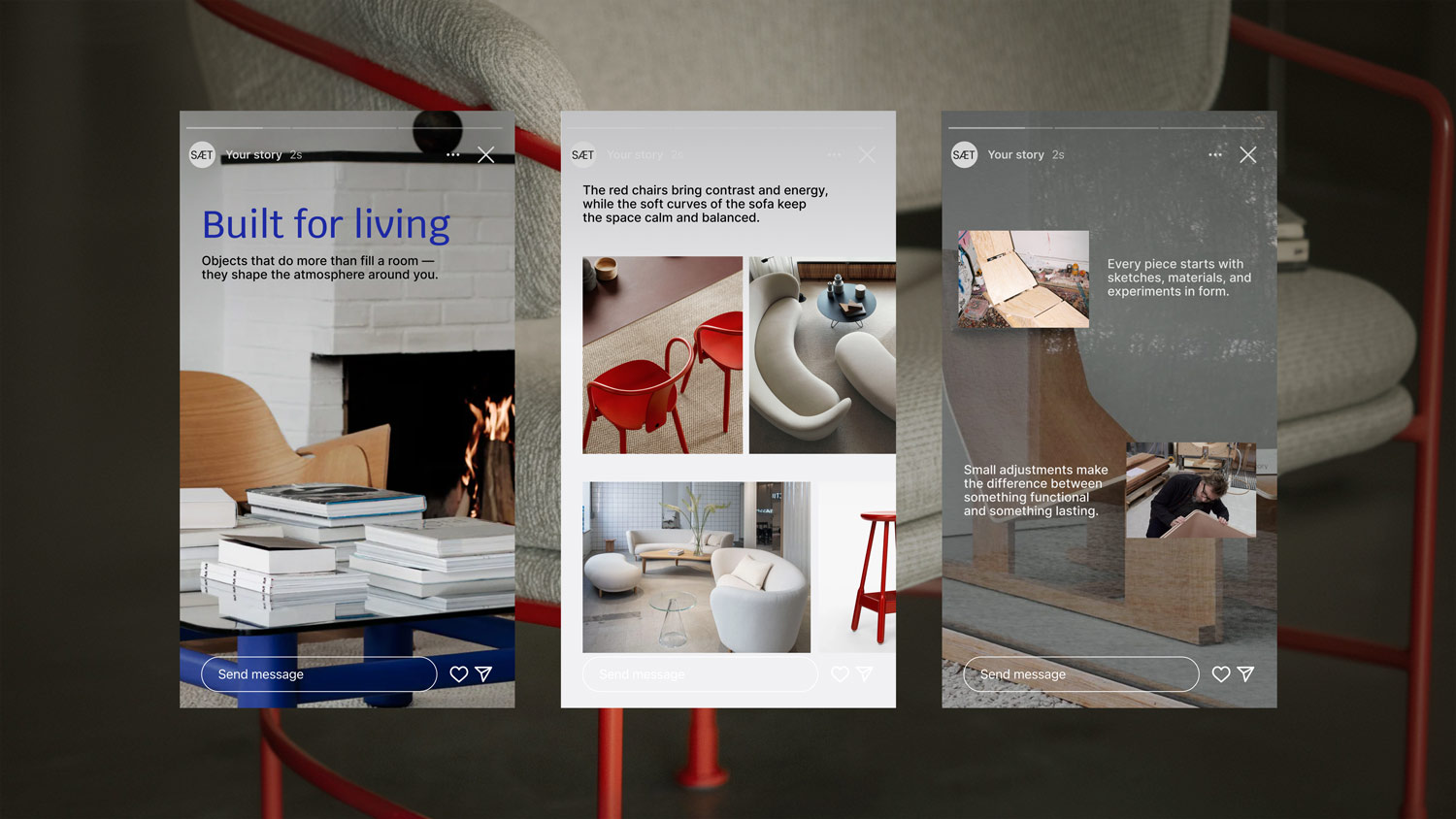
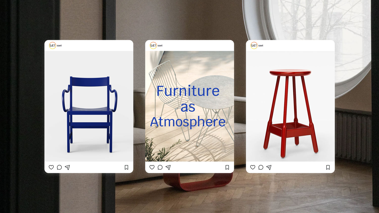
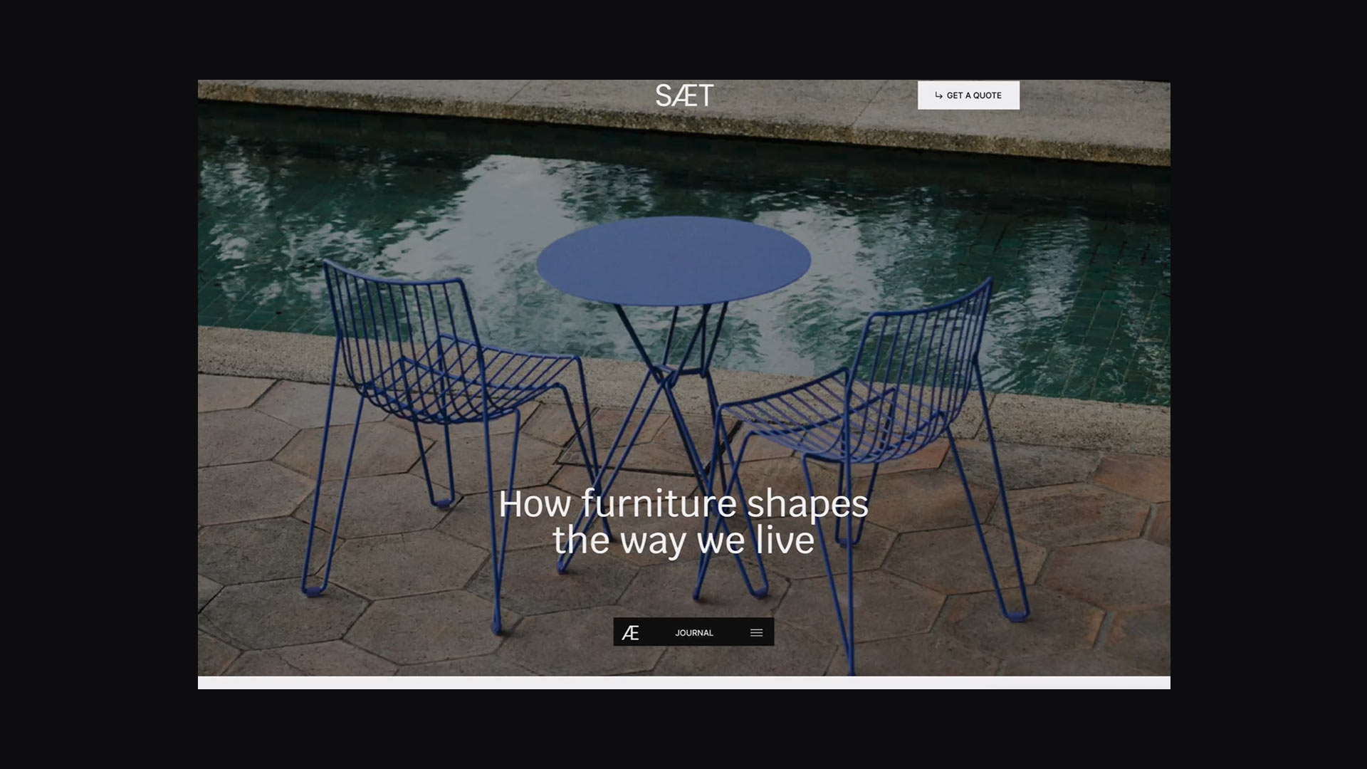
Beyond the core identity, we demonstrated how the system functions across digital environments: on the website, in social media, and throughout brand communication.
Every element was designed to support a sense of cohesion, calmness, and contemporary object-focused aesthetics.
As a result, SAET received a flexible visual system that easily adapts to different touchpoints while building a recognizable brand image without visual noise.



Ready to create something people will talk about?
 Invite us into the project