SHORELINE
We looked at the New York market. At dozens of residential developments all saying the same thing: luxury, comfort, lifestyle — and getting lost in identical promises.
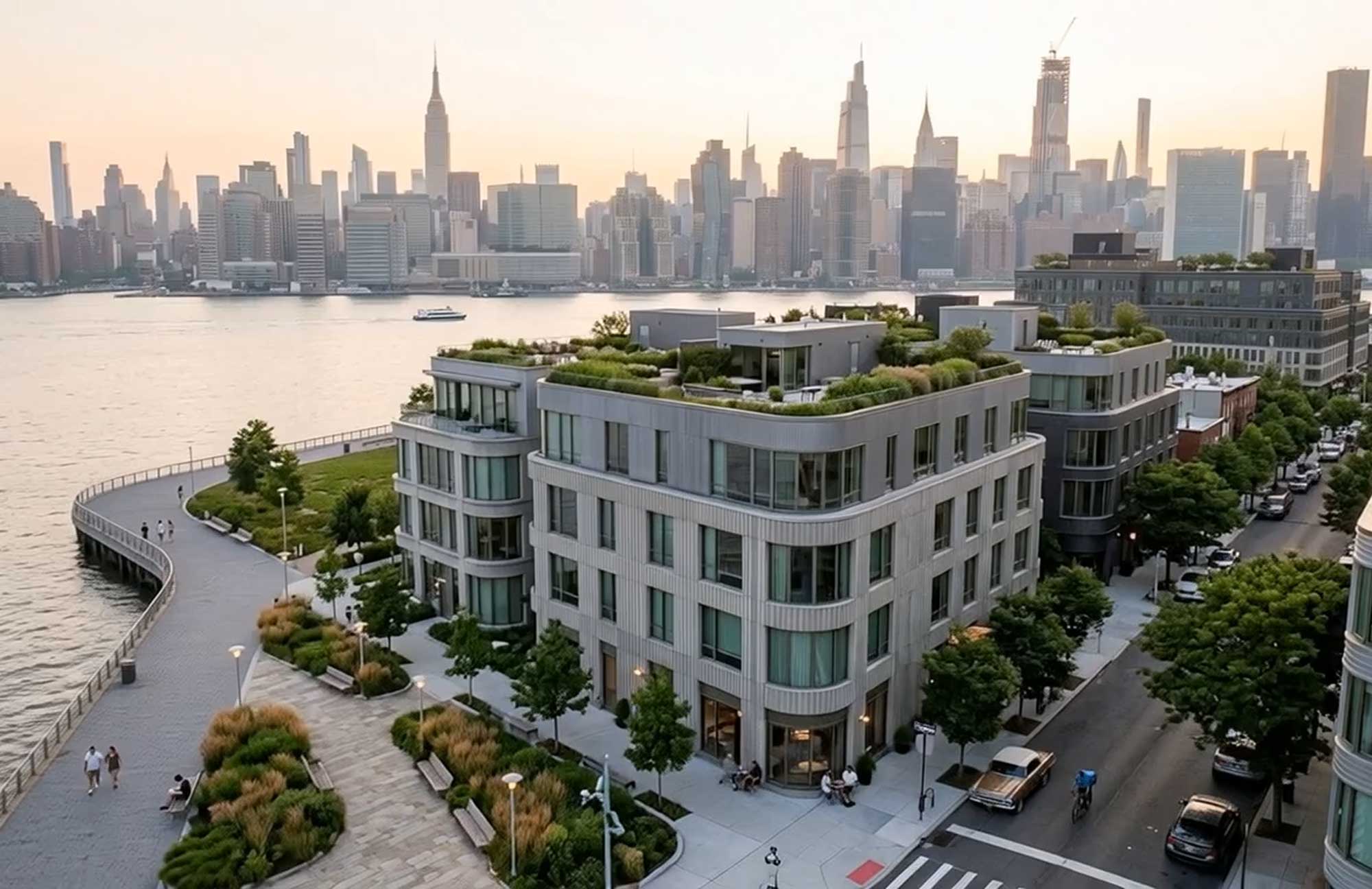
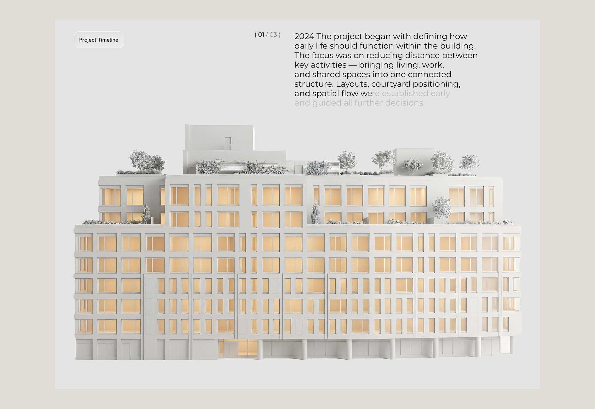
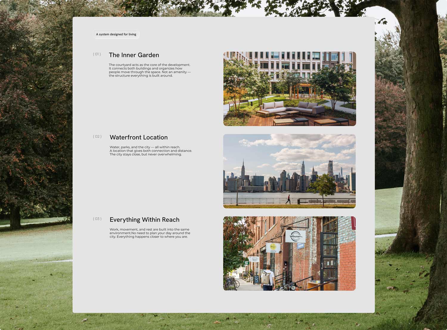
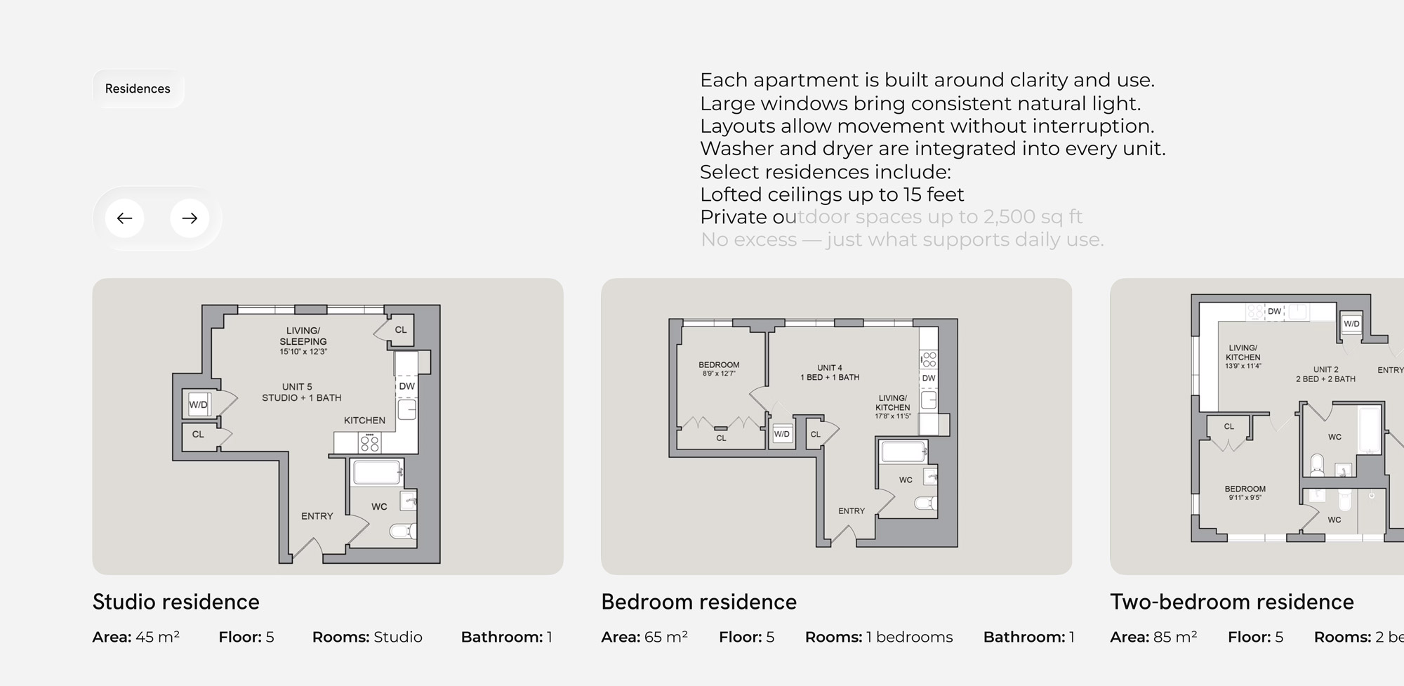
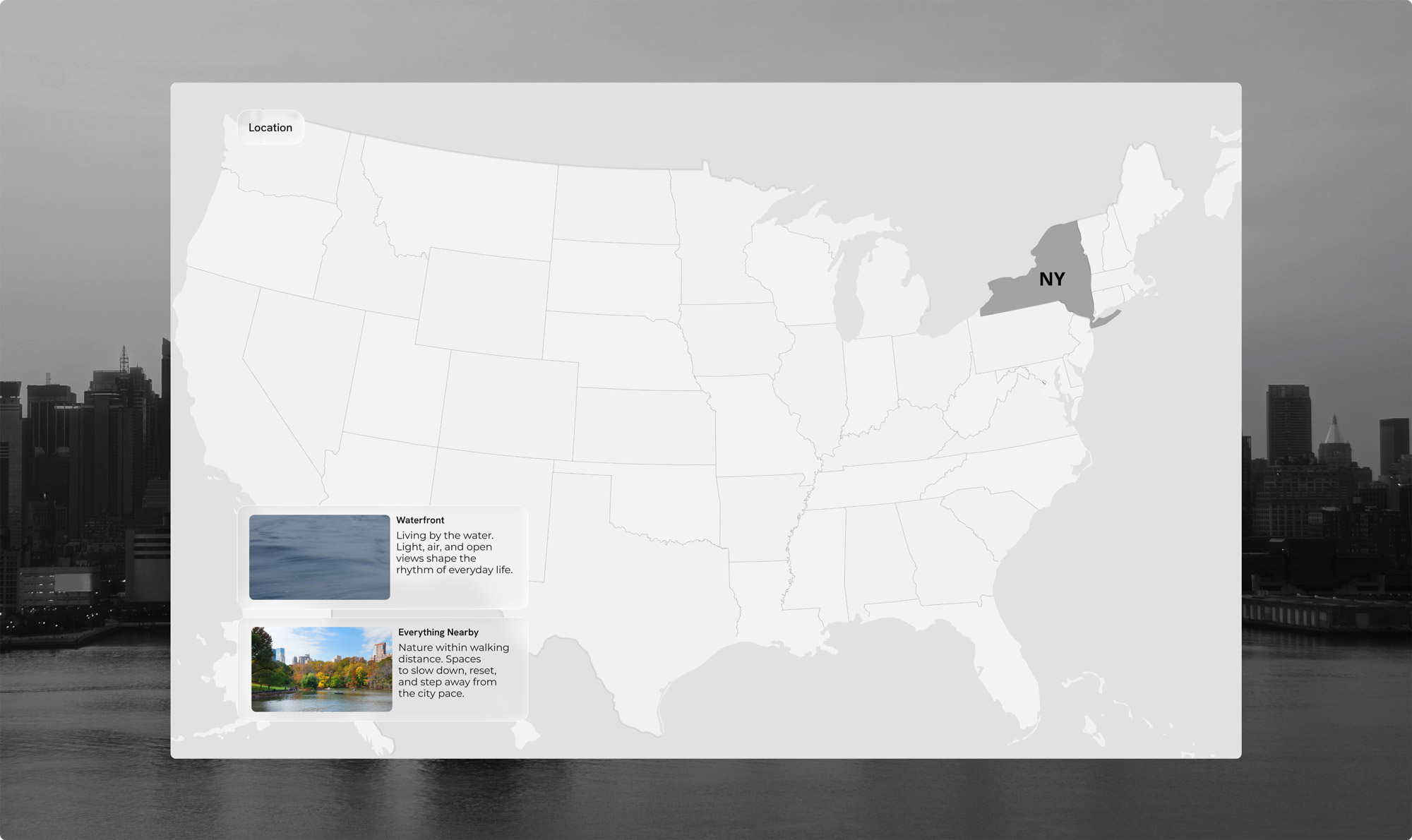
We analyzed competitors across Brooklyn and nearby areas and noticed a pattern: no one explains how the space actually works. That’s how SHORELINE came to life — not as another “better building”, but as a different way to structure everyday life in the city. A space that reduces the distance between daily activities, where life doesn’t break into separate locations, but works as one system.
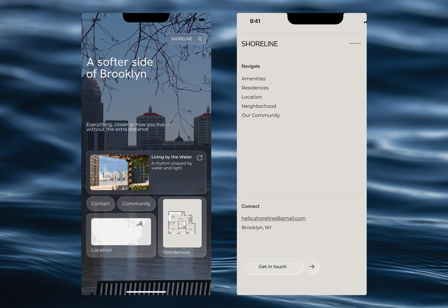
We translated this logic into UI/UX. Each screen continues the idea: fewer breaks, more continuity, smooth transitions between sections. The user doesn’t just browse the website — they move through it.
The result is not just a landing page, but a tool that explains the project and sets it apart from others.
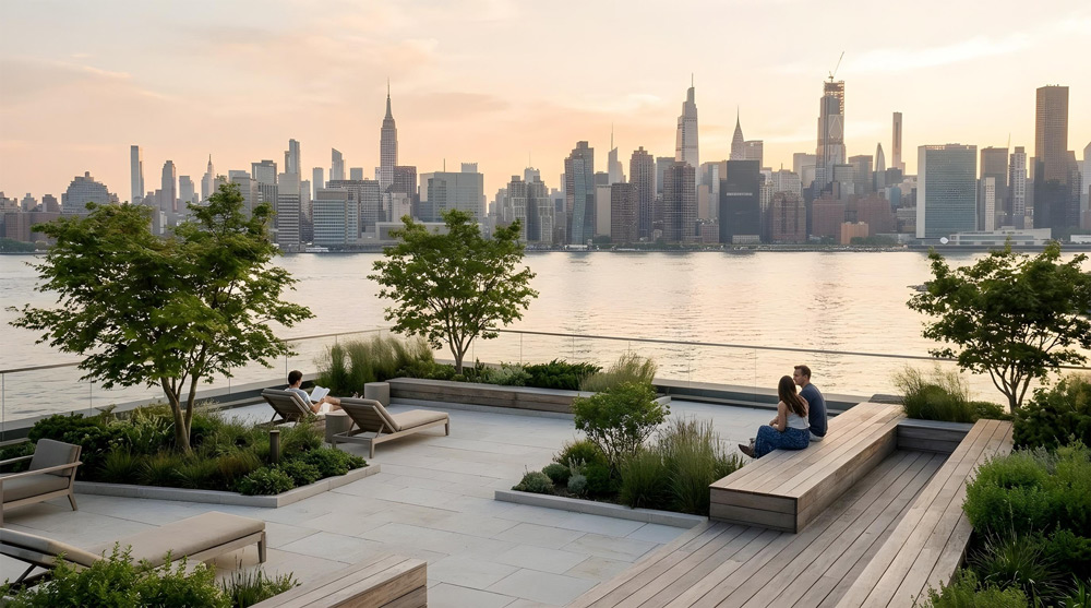
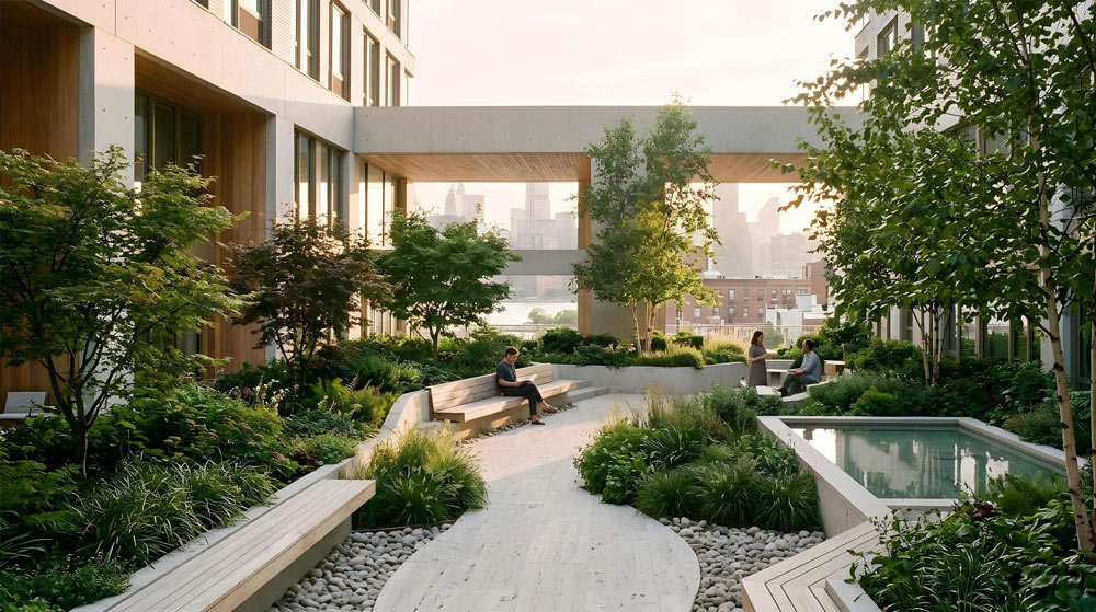
This is not about how the building looks. It’s about how it feels to live in it.



Ready to create something people will talk about?
 Invite us into the project